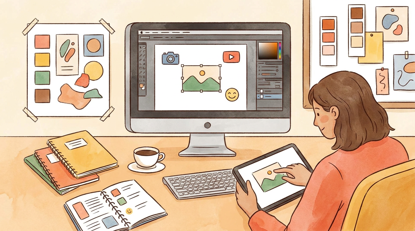
To create a YouTube thumbnail in 2026, make a clear visual promise for the video, build one focal point around it, export at 3840 × 2160 for standard videos, then upload and test it in YouTube Studio. For Shorts, use a vertical 2160 × 3840 image and upload the custom thumbnail from Studio on a computer.
You’ve made a solid video, but nobody clicks because the thumbnail looks like a random frame, says too much, or promises something the video never delivers. A good YouTube thumbnail is not decoration. It is the first part of the video.
Key takeaways
- YouTube recommends
3840 × 2160pixels for standard video thumbnails, with a minimum width of640pixels. - YouTube recommends
2160 × 3840pixels in9:16for Shorts thumbnails, with a minimum height of640pixels. - Mobile thumbnail uploads are limited to
2 MB, while desktop uploads allow50 MBfor video, Shorts and podcast thumbnails. - YouTube says 90% of its best-performing videos use custom thumbnails.
- YouTube Test & Compare can test up to three thumbnails, choosing a winner by watch time share rather than CTR alone.
What is the best way to create a YouTube thumbnail?
The best way to create a YouTube thumbnail is to decide the viewer’s reason to click before opening any design tool. Build the image around one visible idea, make the subject readable at feed size, and ensure the video genuinely delivers the promise. That beats copying a loud template every time.
Most weak thumbnails have the same flaw: they are trying to summarise the whole video.
A thumbnail is not a miniature slide deck. It is not a place for your logo, five screenshots, a title repeated word-for-word, and a floating reaction face. The job is narrower. A viewer should understand the tension, result, question or transformation in a quick glance.
Start with this sentence:
“Someone should click this video because they want to find out ________.”
For example, imagine your video title is: “I Tested Cheap Amazon Camera Gear for a Week”.
Your thumbnail promise could be:
- A camera rig that looks suspiciously cheap beside an expensive-looking result
- A broken-looking accessory with a clear visual question around it
- Your reaction to an unexpectedly good or terrible result
- A before-and-after shot showing what the cheap gear actually produced
Do not put “I Tested Cheap Amazon Camera Gear for a Week” on the image. The title already handles that context. Make the thumbnail add curiosity, contrast or proof.
Choose one focal point
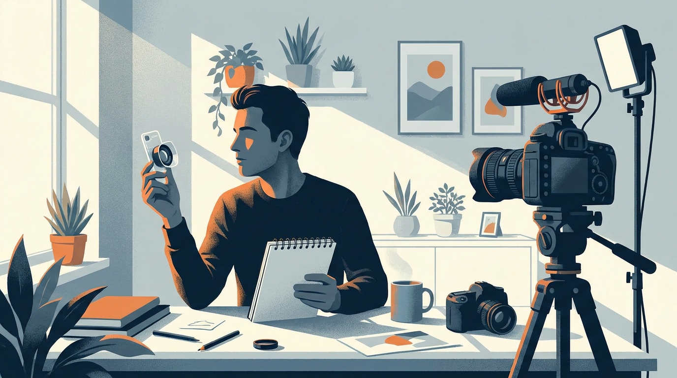
Pick the thing a viewer should see first. It might be your face, an object, a result, a location, or a visual contrast. Then remove everything that competes with it.
A cooking video about making restaurant-style chips could use a close-up of crisp chips and a failed burnt batch in the corner. A finance video about cutting spending could show a bank card being cut beside a stack of delivery receipts. A tutorial about editing videos could show the finished cinematic frame, not a cluttered screenshot of the entire timeline.
The right focal point changes with the video. There is no rule that says every thumbnail needs a face. There is no evidence-backed rule saying every thumbnail needs a certain number of words either. Use a face when the human reaction is the story. Use an object when the object is the story.
Make the visual promise specific
Vague thumbnails die in crowded feeds.
“MY NEW VIDEO” tells viewers nothing. So does a smiling face with a generic blue background. Even polished design cannot rescue an unclear promise.
Use visual specificity instead:
Video topic | Weak thumbnail idea | Better visual promise |
|---|---|---|
Home renovation | Wide photo of a room | Ruined wall beside the finished wall |
Productivity experiment | Person at laptop | Phone locked in a box beside a focused workspace |
Travel vlog | Airport selfie | Creator standing at an unusual destination feature |
Gaming challenge | Busy gameplay screenshot | One impossible in-game moment or reaction |
Recipe video | Full kitchen shot | The final dish split against the failed first attempt |
The better concept gives the viewer a reason to ask a question. What happened to that wall? Did locking the phone work? Is that place real? Can that gaming result actually happen?
That question is the click.
What size should a YouTube thumbnail be?
YouTube’s current recommended thumbnail size for standard videos is 3840 × 2160 pixels in a 16:9 ratio, while Shorts need a vertical 2160 × 3840 image in 9:16. Exporting at the right size prevents soft images, awkward crops and avoidable upload problems before your video even reaches viewers.
The old 1280 × 720 export is still a workable 16:9 size, but it should not be your lead recommendation in a current YouTube thumbnail workflow. YouTube’s own Help Centre now recommends 3840 × 2160 for standard video thumbnails.
Video type | Recommended dimensions | Aspect ratio | Minimum dimension | Upload limit |
|---|---|---|---|---|
Standard YouTube video |
|
|
|
|
YouTube Short |
|
|
|
|
YouTube accepts formats including JPG and PNG. JPG is usually the practical choice for photos and image-heavy designs because it can keep file sizes down. PNG is useful when crisp text, graphic shapes or clean edges matter more.
If your file will not upload from your phone, check the file size first. YouTube limits video-thumbnail uploads on mobile to 2 MB, compared with 50 MB for video, Shorts and podcast thumbnails uploaded on desktop. Open the image on a computer, export it again at sensible compression, then upload through Studio.
You can check your design against common platform dimensions with a thumbnail size reference, or use a thumbnail resizer when you need separate versions for YouTube, TikTok and Reels.
Design for the crop, not just the canvas
A thumbnail can look perfect in your editor and fail in the feed because the important thing is tiny, cropped or obscured by interface elements.
Keep the central subject large. Leave the outer edges free of essential details. Do not place important text close to the bottom-right corner where duration labels and platform UI can compete with it.
Before uploading, look at the image at a small size. Better still, use a thumbnail preview tool to check how the design holds up in a feed-like view. If the concept only works when you zoom in, rebuild it.

How do you make a YouTube thumbnail free without Photoshop?
You can make a YouTube thumbnail free without Photoshop by using a browser-based editor, a simple template, or a video-aware thumbnail tool, but the tool matters less than the workflow. Choose one promise, collect only the visual elements that prove it, make a clean composition, then export at YouTube’s correct dimensions.
Canva is a sensible starting point for someone who needs templates, stock assets and drag-and-drop editing. But templates create a common trap: creators change the colours and words while leaving the original concept intact.
The result looks designed, but it does not look like it belongs to your video.
Use a template for spacing, type hierarchy and basic layout if you need it. Then replace the generic premise with your actual premise. A productivity template with a clock and a shocked face is not automatically right for a video about testing a morning routine.
This Canva walkthrough is useful if you want to see a beginner-friendly template workflow in action:
A practical thumbnail workflow
- Write the video’s click promise in one sentence.
- Choose one subject that visually proves or dramatises that promise.
- Find a clean frame from the video, take a still photo, or use an original supporting image.
- Build a simple composition around the main subject.
- Add text only if the image needs a short clarifier.
- Check the thumbnail at small size before exporting.
- Export as JPG or PNG at
3840 × 2160for standard videos. - Upload the thumbnail in YouTube Studio and test alternatives where possible.
A tool that watches the footage can reduce the painful bit, which is hunting through an edit for usable frames and trying to turn them into concepts. Thumbn is built around that workflow: it analyses your video and generates thumbnail directions from what actually appears in it. That is more useful than generating attractive images disconnected from the video’s content.
AI can help with background cleanup, layout ideas and supporting visual elements. But do not build your entire thumbnail around a fake version of a recognisable public figure or another identifiable person. Image models can refuse those requests, and even when an output is possible, it can look unconvincing or create a trust problem with viewers.
When text improves a thumbnail
Text earns its place when it sharpens the visual idea. It does not earn its place because every popular creator uses it.
Good uses of text include:
- Naming a clear challenge, result or condition
- Explaining a visual contrast that viewers could otherwise miss
- Adding a short emotional or factual twist
- Clarifying an unfamiliar object or situation
Bad uses of text include:
- Repeating the full video title
- Explaining every step in a tutorial
- Adding tiny labels around multiple objects
- Using a paragraph because the image has no actual story
If you use text, make it readable from a distance. One strong word is more useful than six tiny ones. And if removing the text makes the idea collapse, the image may not be doing enough work.
How do you upload a custom thumbnail to YouTube?
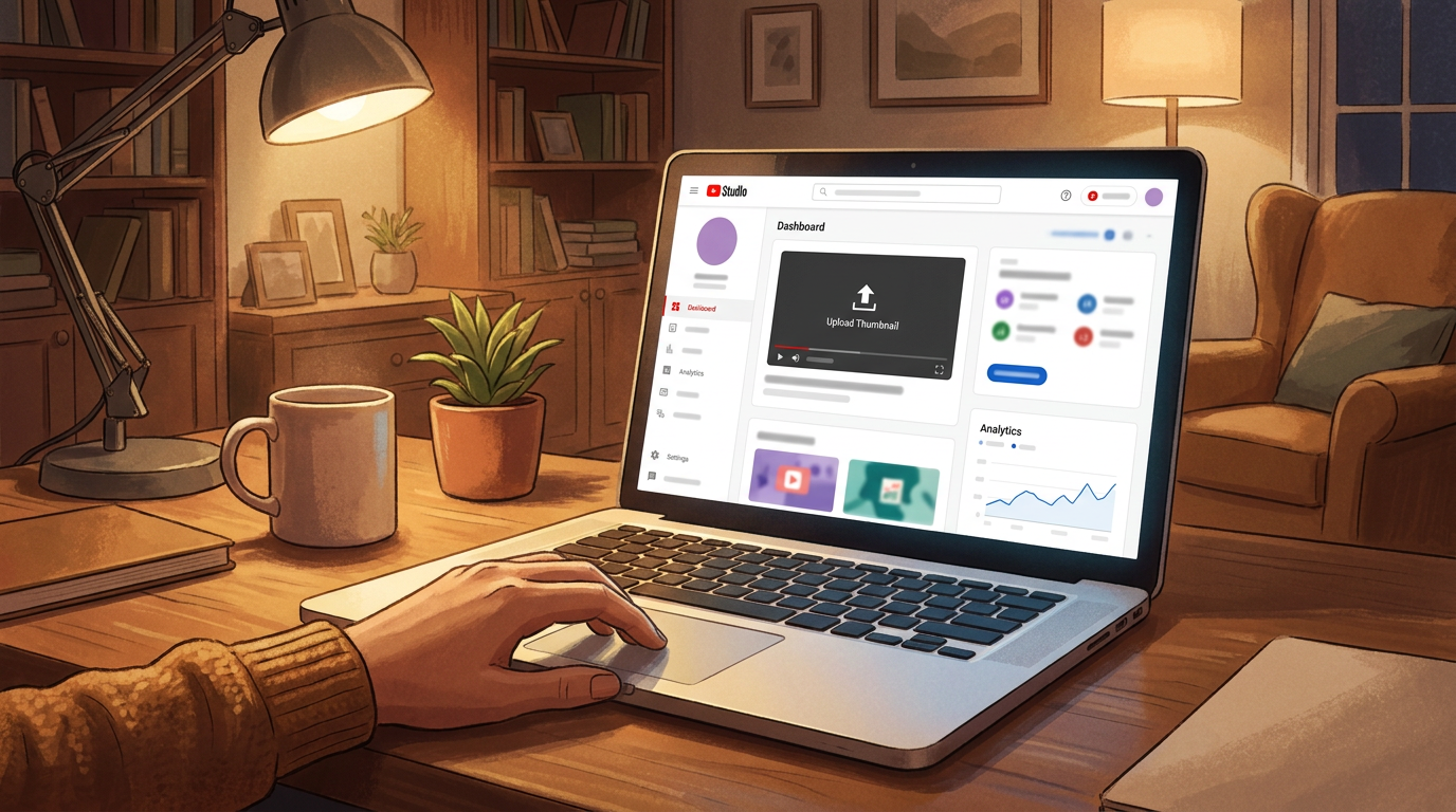
To upload a custom thumbnail for a standard YouTube video, go to YouTube Studio → Content → select the video → Thumbnail → Upload file → Save. Custom thumbnails require phone verification for intermediate-feature access, not a verification badge and not a minimum subscriber count.
YouTube’s official upload instructions confirm that exact Studio path. The process is quick once the feature is enabled, but plenty of creators get stuck before they reach it.
If Upload file is missing, check your feature eligibility:
- Open
YouTube Studio. - Select
Settings. - Choose
Channel. - Open
Feature eligibility. - Complete phone verification to access intermediate features.
YouTube says phone verification unlocks intermediate features, including custom thumbnails. This is not the same thing as having a channel verification badge. The badge is about identity and authenticity. Phone verification enables certain creator features.
YouTube can also apply daily limits to custom thumbnail uploads. The platform says those limits vary by country or region and channel history, and copyright or Community Guidelines strikes can affect eligibility. There is no published universal daily number, so ignore anyone claiming there is one.
Can you upload a custom thumbnail for a YouTube Short?
Yes, but Shorts follow different rules. YouTube currently allows custom thumbnail uploads for Shorts through YouTube Studio on a computer, and the account must be verified.
Use the vertical 2160 × 3840 design rather than recycling your horizontal long-form thumbnail. That gives your Short a chance to look intentional where vertical media is shown.
There is another catch. YouTube says a vertical video using a 16:9 custom thumbnail can have that thumbnail replaced with an automatically generated 4:5 thumbnail on Home, Explore and Subscriptions. Your custom version can still appear in the watch feed, watch history and non-mobile placements, but that is not a reason to gamble on a landscape design.
Make a vertical cover for a vertical video.
For the detailed visual rules around labels, crops and overlays, check the thumbnail safe zones guide. And if your channel is mainly Shorts-led, pair this with the blog’s advice on getting more YouTube Shorts views.
How do you make a YouTube thumbnail that gets more clicks?
A YouTube thumbnail gets more worthwhile clicks when it creates accurate curiosity, clearly separates itself from nearby videos, and prepares viewers for what they will actually watch. Do not optimise for clicks in isolation, because YouTube’s own thumbnail testing system judges options by watch time share rather than click-through rate alone.
This is where a lot of thumbnail advice goes wrong. It treats CTR as the only scoreboard, then recommends making every design louder, more emotional and more extreme.
That can produce clicks. It can also produce immediate disappointment.
YouTube’s Test & Compare tool selects a winning thumbnail based on watch time share, not CTR alone. A thumbnail should earn the click and set up the viewing experience accurately enough that the right people keep watching.
The best thumbnail is not the one that tricks the most people into clicking. It is the one that attracts the viewers your video can satisfy.
Match the title and thumbnail without duplicating them
Your title and thumbnail should act like a two-part sentence.
If the title says, “I Tried Living Without My Phone for a Week”, the thumbnail could show the phone sealed in a clear box. The title tells viewers the challenge. The thumbnail makes it tangible.
If the title says, “Why My £2,000 Camera Was a Waste of Money”, the thumbnail could show the camera in your hand beside a clearly better-looking result from another device. Do not add “£2,000 CAMERA WAS A WASTE OF MONEY” in oversized type. The title already did that job.
Ask two questions before publishing:
- Does the image reveal a different part of the story from the title?
- Would someone who clicks feel that the first minute delivers the promise?
If either answer is no, revise it.
What actively hurts thumbnail performance?
Some thumbnail mistakes do more than look amateur. They make your video less understandable, less trustworthy or harder to choose.
Avoid these:
- Tiny text that disappears on mobile
- Multiple competing subjects with no clear focal point
- Dark screenshots with no contrast or obvious story
- Generic stock images unrelated to the video
- Repeating the full title inside the image
- Fake reactions that do not match the video
- Misleading claims, outcomes or imagery
- Visual clutter added just to make the thumbnail feel “busy”
Misleading thumbnails are not only bad strategy. YouTube’s thumbnail policy prohibits thumbnails that mislead viewers about the video’s contents. The policy also prohibits pornographic imagery, nudity, shocking violent or gory imagery, and vulgar or lewd language.
A dramatic thumbnail is fine. A dishonest one is not.
Use Test & Compare properly
YouTube Test & Compare allows creators with advanced-feature access to test up to three thumbnails on one video. That gives you a better decision process than asking friends which version they “like”.
Make your variants meaningfully different.
Do not test three almost identical designs where you only changed a background shade. Test different promises:
Version | What changes | What you are testing |
|---|---|---|
A | Creator reaction with the key object | Personality and emotion |
B | Close-up of the result | Visual proof |
C | Before-and-after composition | Transformation and contrast |
Results can take a few days to up to two weeks. YouTube may not select a winner if the video has low impressions or the variants are too similar. That is not a failed test. It means you did not collect a clear enough signal.
For a deeper breakdown of composition and visual hierarchy, read the YouTube thumbnail design principles guide. This article is deliberately narrower: it is about making, uploading and testing the thumbnail, not collecting a list of design trends.
FAQ
YouTube thumbnail questions usually come down to dimensions, upload access, Shorts behaviour and whether a design can actually improve video performance. The answers below stick to YouTube’s current documented rules, so you can publish without following outdated 1280 × 720 advice or confusing account verification with feature access.
What size should a YouTube thumbnail be in 2026?
For a standard YouTube video, use 3840 × 2160 pixels in 16:9. YouTube’s current recommendation is 3840 × 2160, with a minimum width of 640 pixels. For Shorts, use 2160 × 3840 pixels in a 9:16 ratio, with a minimum height of 640 pixels.
Can I use 1280 × 720 for a YouTube thumbnail?
You can use 1280 × 720 as a workable 16:9 export, but it is no longer YouTube’s current recommended target. YouTube recommends 3840 × 2160 for standard thumbnails. Start there unless your workflow has a specific reason to use a smaller file.
Why can’t I upload a custom thumbnail on YouTube?
You probably need to enable intermediate features through phone verification. Go to YouTube Studio → Settings → Channel → Feature eligibility. YouTube confirms that phone verification unlocks intermediate features, including custom thumbnails. A channel verification badge and subscriber count do not control this feature.
Can I upload a custom thumbnail for YouTube Shorts?
Yes. Custom thumbnails for Shorts are currently uploaded through YouTube Studio on a computer and require account verification. Use a vertical 2160 × 3840 image rather than a landscape thumbnail made for long-form videos.
How much can a YouTube thumbnail file size be?
YouTube allows up to 2 MB when uploading a video thumbnail on mobile. On desktop, the limit is 50 MB for video, Shorts and podcast thumbnails. Exporting as JPG often helps reduce file size without changing the core design.
Does changing a YouTube thumbnail increase views?
Changing a thumbnail can help if the current one fails to communicate the video’s value, but no honest creator can promise a fixed uplift. YouTube’s Test & Compare evaluates thumbnails by watch time share, not clicks alone, and it may return no winner when impressions are low or variants are too similar.
Should I put my face in every YouTube thumbnail?
No. Use your face when your expression, identity or reaction is central to the video’s promise. Use the product, result, location or transformation when that tells the story faster. A face is a creative choice, not a YouTube requirement.
Can a YouTube thumbnail be misleading?
No. YouTube prohibits thumbnails that mislead viewers about the video’s actual content. It also restricts pornographic imagery, nudity, shocking violence or gore, and vulgar or lewd language. If the video cannot deliver what the image implies, redesign the image.
A thumbnail is finished when it makes the right viewer think, “I need to see what happened here”, and your opening seconds prove they made the right choice. Make that promise clear, keep the design clean, upload the right file, then test ideas that genuinely compete.